 Home Page
One consideration that needs to be built in to any current website is what to do about various size devices. My own web pages have to appear on smart phones, tablets, laptops, desktops, and classroom projectors. For many years, I only had to accommodate laptops and desktops, which were close enough in display size to not have to worry too much. Then our classrooms got projectors and screens, and material had to be big enough for folks on the back row to read. Around the same time, Steve Jobs said "Fiat iPhone," and there was iPhone.
A Reminder from Last Week
|

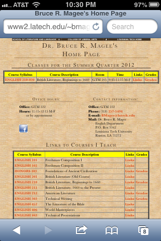
Here is my old
home page as it looked in the summer of 2012. With
minor modifications, it looked like this for about ten
years. It wasn't very complicated or trendy, but it
worked as a portal to my web site. I was happy enough with it
until I got an iPhone. Then my navigation bar at the top
of the page became unusably small.
Once I got an iPhone, I got to look at this several times a
day. It needed an upgrade.
When I began work on the Louisiana Anthology, I spent several
months investigating different methods of publishing it before
settling on my present approach. Much of my web site is
still unreconstructed because I actually find it easier to
make new pages that follow new standards than to go in and
redo an old page. So far, I have three different
adaptive designs I use on my site.
You are welcome to use my css and html for your own
sites. Share and enjoy! Don't panic!
CSS
HTML:
<meta name = "viewport" content = "initial-scale = 1.30>

</head>

<body>

<div id="container">

 <div class="binder">

  <div class="slider">

   <div id="start" class="additional-block">


    <div class="header">

	Dr. Magee - Home Page

    </div>

     <ul class="menu">

       <li><a href="technav.shtml">Tech Links</a></li>

       <li><a href="louisiana_anthology/navigation/index.shtml">Louisiana Anthology</a></li>

       <li><a href="101/101nav.shtml">English 101</a></li>

       <li><a href="102/102nav.shtml">English 102</a></li>

       <li><a href="103/103nav.shtml">Honors 103</a></li>

       <li><a href="201/201nav.shtml">English 201</a></li>

       <li><a href="212/212nav.shtml">English 202</a></li>

       <li><a href="210/210nav.shtml">English 210</a></li>

       <li><a href="211/211nav.shtml">English 211</a></li>

       <li><a href="212/212nav.shtml">English 212</a></li>

       <li><a href="303/303nav.shtml">English 303</a></li>

       <li><a href="406/406nav.shtml">English 406</a></li>

       <li><a href="452/452nav.shtml">English 452</a></li>

       <li><a href="463/463nav.shtml">English 463</a></li>
     </ul>
    </div>
   </div>
  </div>
 </div>
Once I decided to put the anthology on my web site, I had to
determine how to navigate the site. I like the navigation
system of one of my favorite iPhone apps is SPQR, a
combination of Latin library and dictionary. While apps
like Angry Birds might be pure programs, ones like SPQR are
essentially web sites zipped up into an app, meaning we should
be able to emulate its format. I eventually tracked down
an article
on creating an iPhone-style navigation system for a web
site. While I liked the basic design, I had to adapt it
for my purposes.
- I deleted the iPhone image from around the slide bar--I just wanted the bar itself.
- I broke the system into multiple files. When I
looked at the code for the navigation, I discovered that the
entire navigation was embedded in one file. It was
only a few categories that went a few screens deep, but it
was already almost too complex to code by hand, which I was
doing. Also, the file would quickly become so huge
that it would clog up the browsing process. Guilty confession: it took me a
year to figure out that the java script is not necessary
with the navigation broken up into separate files. The
script takes up 71 lines in the file, which isn't that much
until you multiply it by the number of times it occurs on
the whole site; about 14,700 lines of useless code all
together. Argh!
- I forced the navigation bar to the left side of the
screen. Guilty confession:
the consensus now is that this part of building a web page
should be done with <div> coding. I tried this
for a couple of days without success, then got angry and
threw it all in a table. Using tables this way is
SOOOOOO 2002.
- On my navigation pages, I wanted the page to display with
a lot of "eye candy" on desktops, but to zoom in on the
navigation bar on iPhones. The following viewport
command in the <head> of the page makes the iPhone
zoom in on the navigation. You can manually zoom it
out to see the rest of the page, but by default you get a
familiar iPhone menu. YEA.
<html>


	<head>


		<title>Dr. Bruce R. Magee</title>

            <meta name = "viewport" content = "initial-scale = 1.30>
- All of my web pages that end with .shtml are actually
composites of multiple pages with 'includes' files. So
this file:
Gets pulled into a larger page and looks like this:
- Once the navigation system is in place, I can edit just
the list that has the items in it without having to disturb
the larger page. It's easier to avoid, find, and fix
mistakes with this system.
