 Home Page
- Lecture.mp3
- Listen in iTunes
- Listen on Stitcher
-
Four. Writing
Assignment Four. Select one of the following four categories
as they appear in Chapters Five through Eight of IDW:
- Chapter Five: "Printed Matter Case Studies" (Magazines, Packaging, and Corporate Communications)
- Chapter Six: "Information Graphics Case Studies" (Maps, Charts, and Diagrams)
- Chapter Seven: "Interactive Case Studies" (Websites and screen-based projects)
- Chapter Eight: "Environmental Case Studies" (Wayfinding and Exhibits)
Each chapter, or category, contains a
number of real-world case studies that discuss how information
design principles were used to create a product. For example,
in chapter five, one case study describes how and why a design
firm was asked to re-conceptualize the way that TIME Magazine
presents its information. Other case studies in this chapter
discuss the packaging design label on a modern trash can, or
the promotional materials of a major paper manufacturer. Other
chapters provide examples of charts that were designed to
inform audiences of the crisis concerning the global water
supply, or brochures showcasing the appearance of a
commercial-grade oven designed for the home, or wayfaring
material for the Los Angeles public transport system, etc.
Your task is to select one of these
specific case studies, from a chapter in IDW, and describe why
they may be effective and pleasing to a user by referring to
design principles in UPD. For example, your choice might be a
chart that was created to inform employees of the functions of
various equipment and processes that take place in a factory.
You would refer to the specific case study in IDW that you
have chosen, summarize the problem or need and how it was
resolved, and explain how design principles in UPD may be used
to describe the final product, whether that product be a map,
a webpage, a corporate document, signage, and so on. Please
try to refer to five of the principles in UPD for the case
study. If you cannot find at least five principles that seem
to apply, make certain you are especially descriptive.
Usually, however, you should be able to find many more than
five, in which case you should choose the ones that seem to be
the most accurate and interesting.

NOTE: This project constitutes assignment Four. It
should be a minimum equivalent of one full single-spaced page,
but no more than two full pages of text -- the document can be
longer for your graphics and formatting. Also, although
inserting graphics above, under, or adjacent to your text is
of course appropriate, please do so with a correct sense of
scale (i.e., no half-a-page pasted in graphic with scant
textual support).

Format
Ok, for our last two written assignments, I'd like you to
experiment with all the elements of formatting we've been
talking about. Several of these we've been doing already.
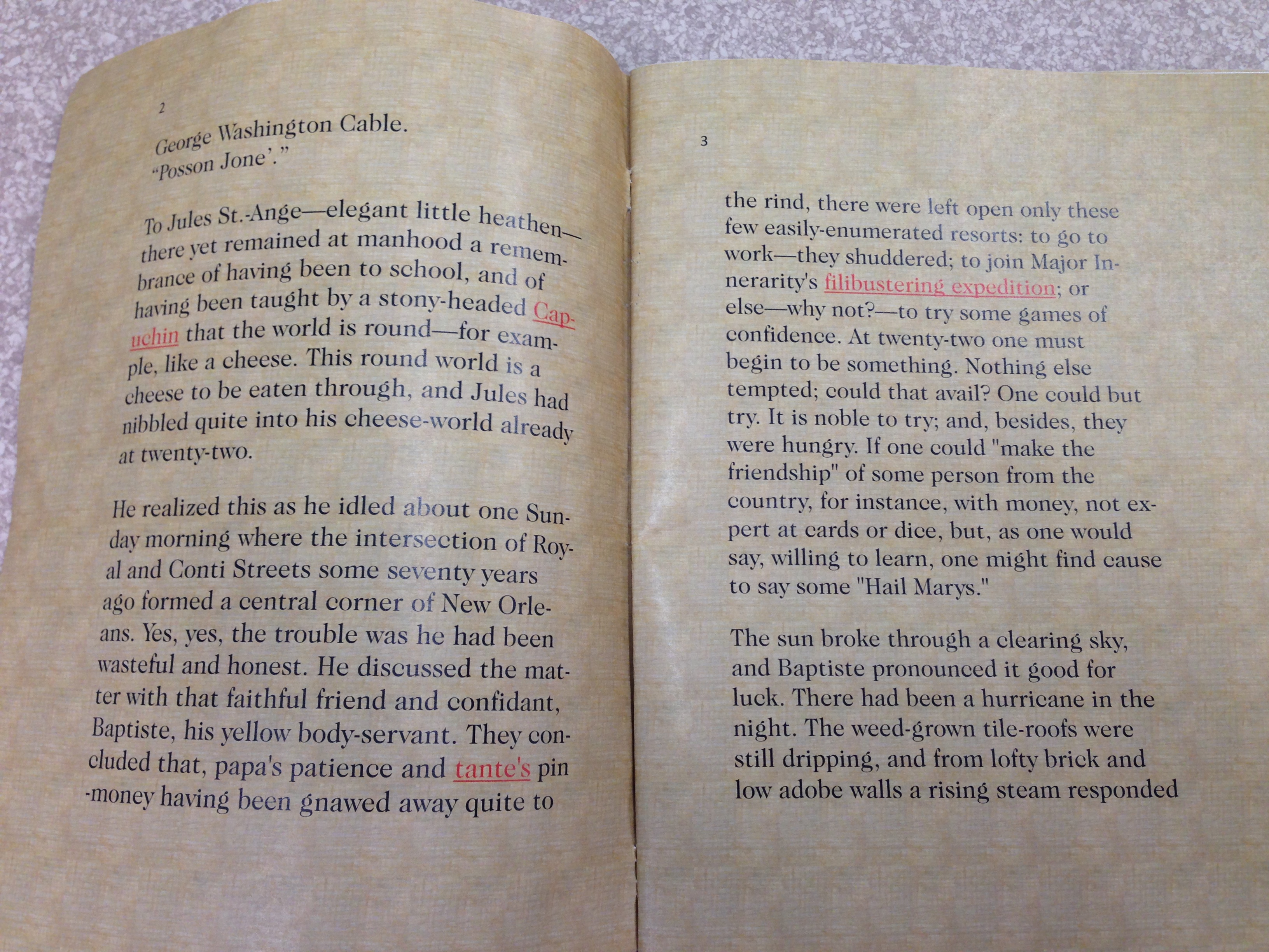
- Choose a professional-looking font that is not Times New Roman. Be sure to include a note at the end of your document saying what font you chose, why, and what Bringhurst has to say about it. (This time it's worth 5% of the grade as a reward for following directions!)
- Choose a font color that's not black. Also look at
altering font size, color, kerning, etc., in headings.
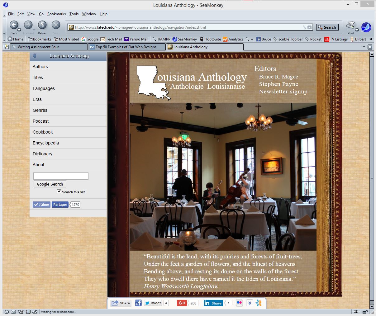
- Choose a document background that is not white: use a
color or an image. Make sure it constrast with and
complements the font color.
- Use good document design principles, with lists, images with captions, etc.
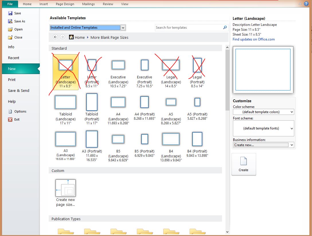
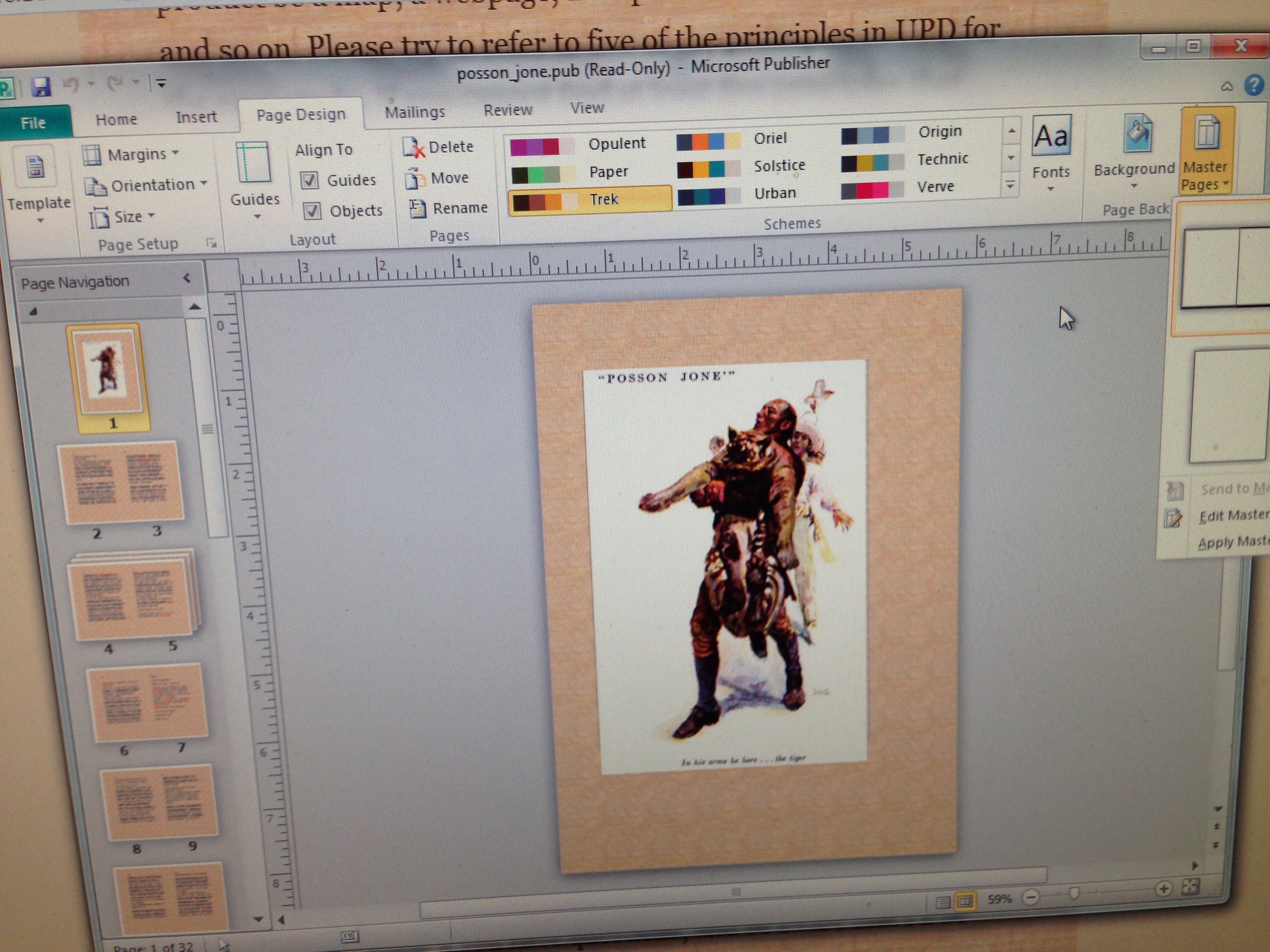
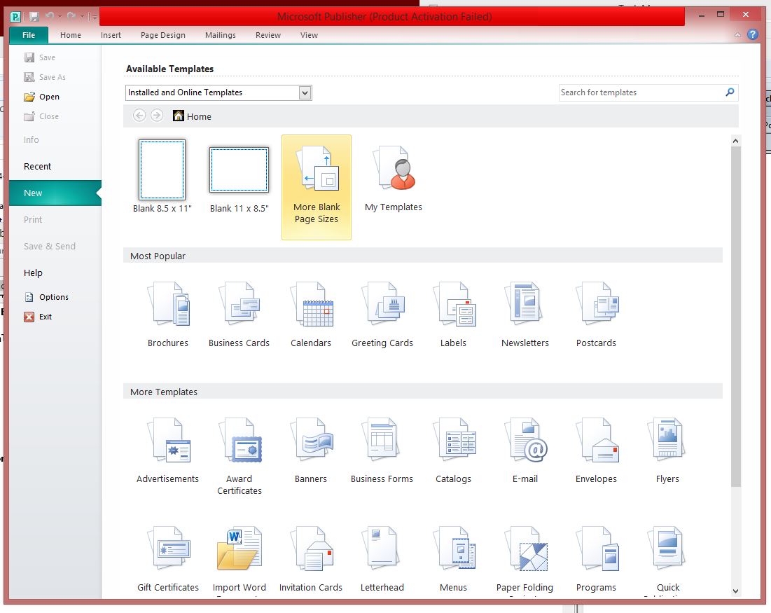
- Use a paper size that is neither 8˝″ x 11″ nor 8˝″ x
14″. I encourge you to use MS Publisher. If
you don't have that, I think Word will also work. Scroll
down the page to the Publisher screenshots to see where
the paper size options are.
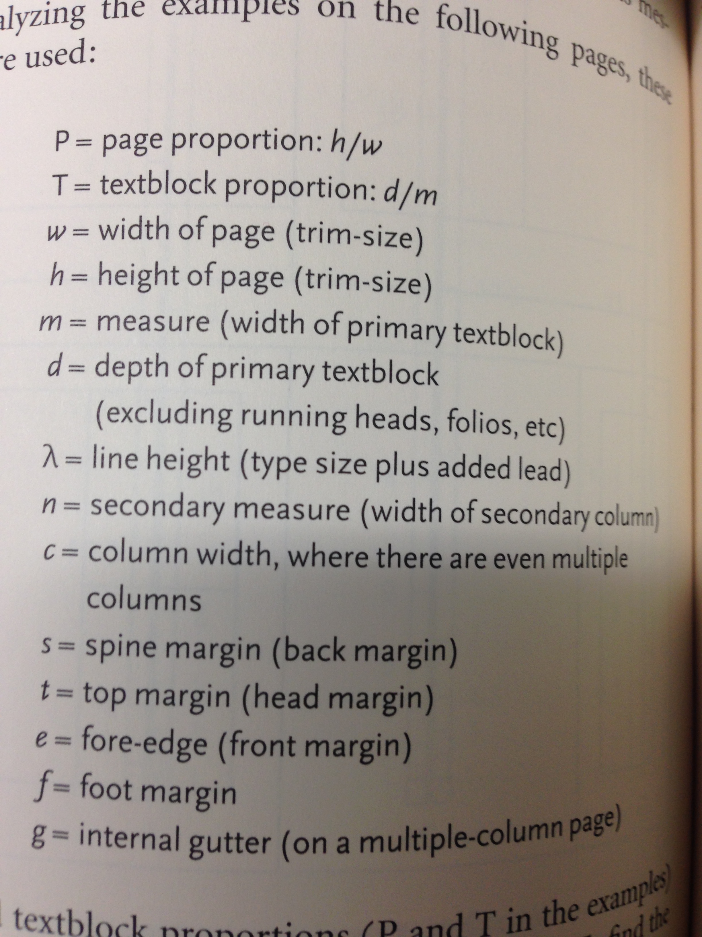
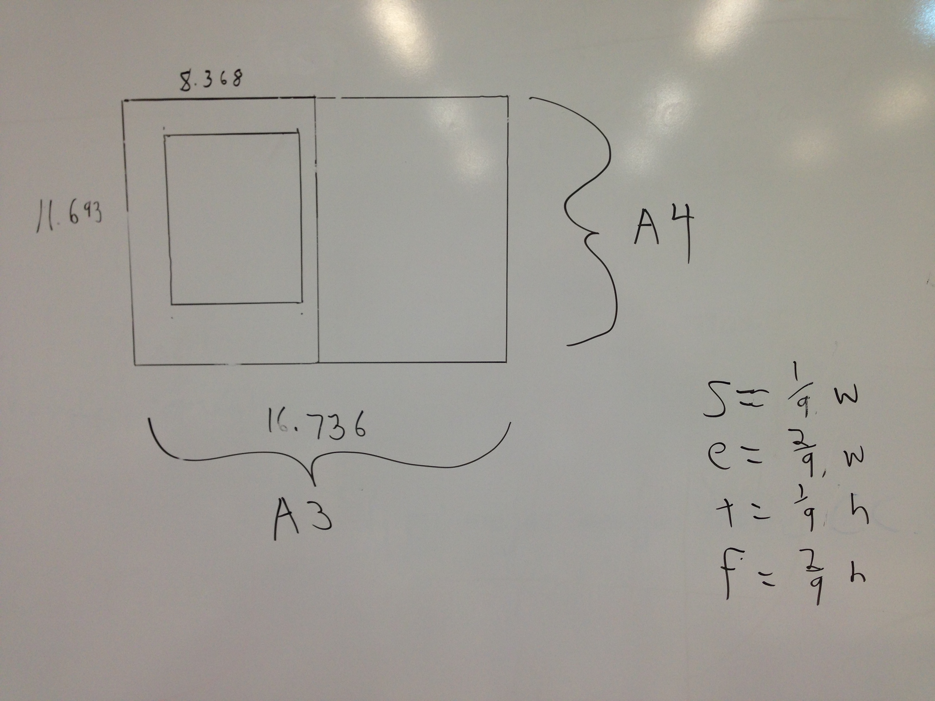
- Select margins that are not 1″. Use one of the
patterns in Bringhurst.
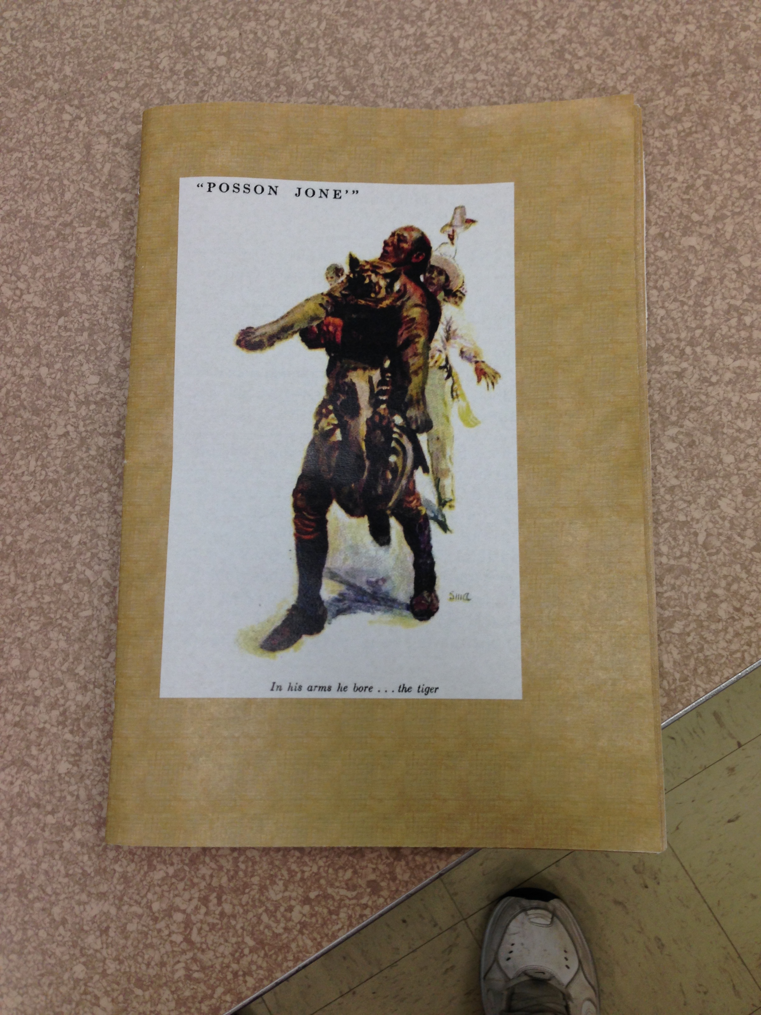
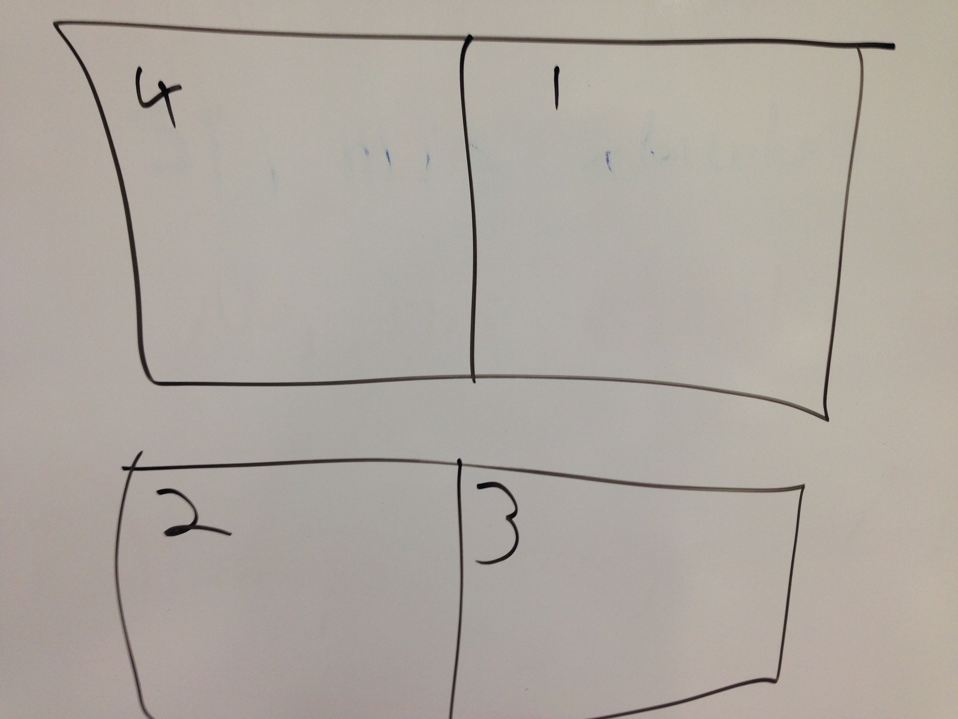
- Print to .pdf
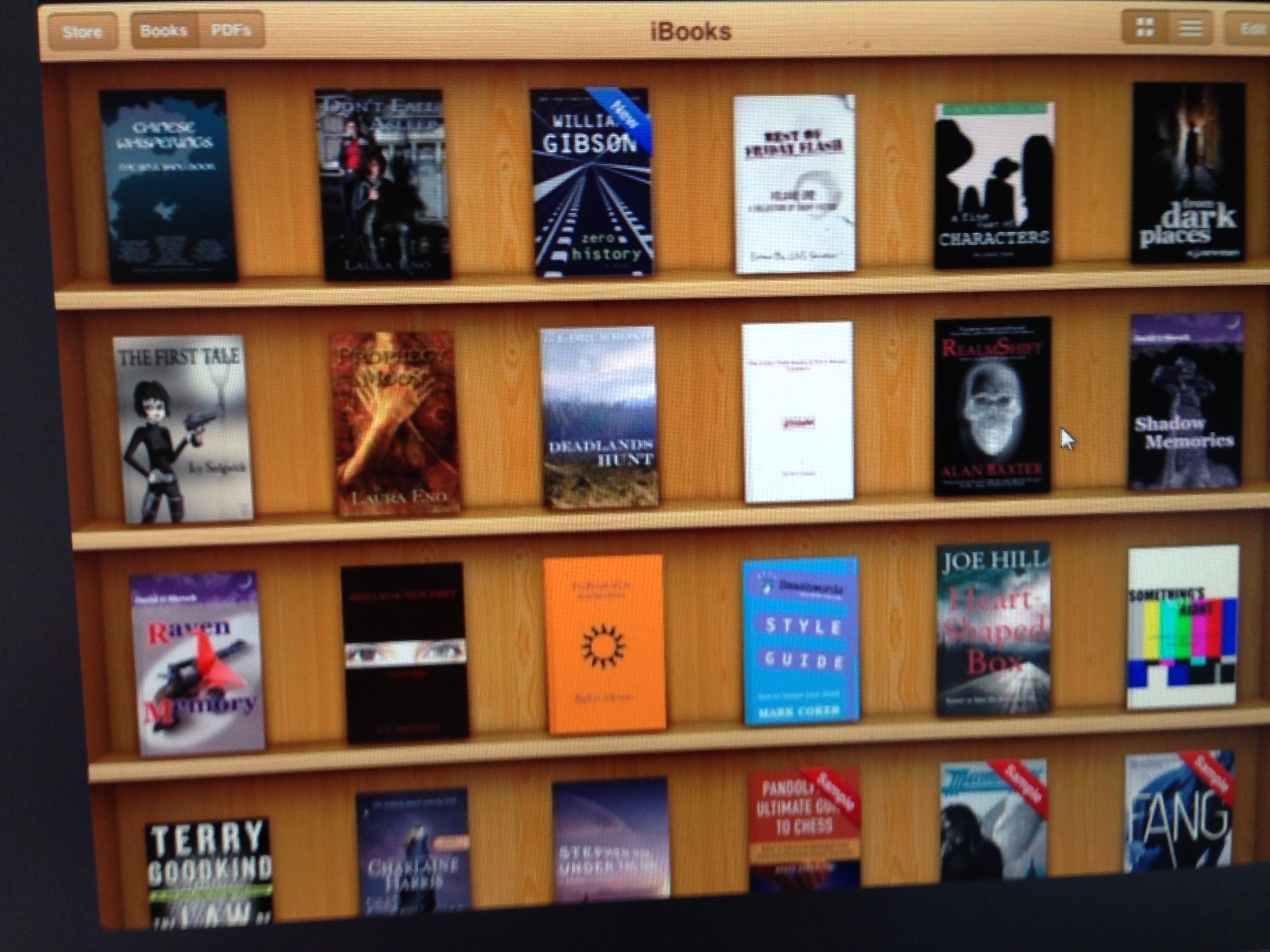
in booklet format. Publisher lets you do this directly;
otherwise, use your printer settings for it. Notice the
page patterns in the way the pdf prints out. Remember what
I say in the lecture about the margins needing to match
the binding.
 Home Page
