Up until the past few years, scientific, technical, and even most business presentations used very few visual aids. The three immutable features of professional presentations the world over were: the speaker, the overhead projector, and a stack of transparencies. The transparencies were usually simple black and white outlines of the talk, predominately consisting of text with few graphics or images. In this simpler time, the amount of effort the speaker had put into preparing the talk could usually be discerned by noting whether the transparencies were hand written or had been prepared on a word processor.
These days, such presentations are passé. Professional presentations now routinely include an audiovisual slideshow, generated by a laptop computer connected to a portable display device such as a projector. The computer programs used to create and deliver the audiovisual aids for such presentations are known as presentation software, or presentation graphics programs. One of the most popular programs of this type is Microsoft’s PowerPoint.
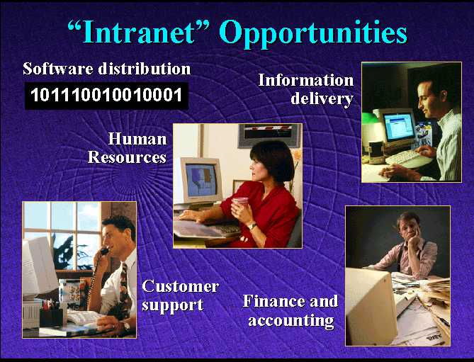
A slide taken from a PowerPoint presentation
Presentation software allows end-users to create professional looking presentations that include text, graphics, high-resolution color photographs, sound effects, and music; together with narration and even limited amounts of video. In addition, visual effects such as “fades” between slides, panning and zooming, and rotation of images and text are usually supported.
contains an image of a slide taken from a PowerPoint presentation.[4] While a still image cannot convey the dynamic aspects of such a presentation, it is possible to get a good feel for the types of media (text, graphics, and photographs) that can be included.
Presentation software packages have become an indispensable communication tool redefining the “look” of professional presentations, but like most tools they must be properly used to increase productivity. Two common mistakes that can negatively affect productivity are: (1) devoting an excessive amount of time to creating a presentation, and (2) loading a presentation down with attractive “eye candy” that distracts the audience and hinders their ability to concentrate on the point of the presentation.
As presentation packages have become more and more sophisticated, in many ways creating professional looking presentations has become easier, thus saving time and increasing productivity. However, it is also the case that as more and more capabilities have been added to presentation software, there has been an increasing temptation on the part of end-users to construct more and more elaborate presentations – adding animations, narration, video clips, etc. As the “bar” of what is considered an acceptable presentation is raised, many professionals find themselves devoting increasing amounts of time to generating more and more elaborate presentations.
Certainly, there are times when a presentation needs to look as “slick” as possible. And no one would argue that the use of photos, charts, and animation are not, on occasion, critical to getting an idea across to an audience. However, indiscriminant use of these features does little to improve a presentation. In fact, features such as animated text and sound effects often do more harm than good – detracting from the speaker’s message by drawing the audience’s attention away from the substance of the talk.
Remember, more is not always better. It is important to resist the temptation to add “bells and whistles” to a presentation just because the software package supports them.
Footnotes
[4] The slide comes from a presentation originally given by Bill Gates, Chairman of Microsoft, and posted to the web.