 Home Page
(MailChimp)
Our next assignment is a web site review. Normally our
focus when we look at a web site is on the content; I'd like
you to look at the web page as an artifact in its on
right.
Please post the MailChimp link to your web site review on Moodle.
- Send the review to yourself.
- Click on the link in the email you receive to "view in your browser."
- Copy that URL and post to Moodle. That way we can all view your newsletter without having to subscribe.
A fairly typical assignment for technical writers is the Company News Letter. More and more of these newsletters are sent out as email rather than printed and passed out, and the best and most popular newsletter service is MailChimp.
Here's the link to my newsletter archive:
http://us9.campaign-archive2.com/home/?u=28c367d050c9e7bfc1a4444d6&id=d18a3a1923
I was able to format my newsletter so that it looks related to the rest of my Louisiana Anthology resources. Notice that it does adapt to smart phones. Format yours as you wish; choose a MailChimp template that adapts to smart phones. MailChimp takes care of the coding; you just pick a template.This is especially helpful for email. The HTML and other coding used in email is several generations behind what's used in web pages.
Writing newsletters is a task frequently given to technical
writers. Email newsletters are much cheaper to send out
than print; they can contain links to other material, and you
can keep an online archive of old newsletters. I'd like
you to send this out to me (bmagee@latech.edu)
and your fellow students as a MailChimp-type
newsletter. You can find anther newsletter site if you
wish, but MailChimp is the main one in the field; it has
templates to make it easy; and it's FREE to small users like
us. Plus I may be able to help you out if you get
stuck. However, if you're used to something else, you
can use that. To see how I use MailChimp, sign up for my
Louisiana Anthology newsletter.
You'll notice mine changes format somewhat to accommodate
smart phones.
I'd like you to select two web sites to compare to each
other. They should be roughly equivalent. Don't
compare Google to LA Tech; you can compare Google to
Bing or LA Tech to MIT. Those of you who have worked on
ongoing web sites can use them as one of your sites (I recall
a church site and a fire fighting site). Using what you
are learning from your reading and discussion about web page
design, evaluate the sites based on aesthetics, usability, and
usefulness.
|
On June 29, 2007, at 6:00 pm local time, the Internet changed with the release of the iPhone. The general trend from the introduction of the World Wide Web in 1991 until then was for ever-bigger monitors, meaning wider web pages and smaller fonts were possible. Hard drives and RAM exploded in size and speed. Also, the wretchedly slow dial-up modem gradually gave way to much faster cable connections, meaning that images and multi-media could be much larger. Suddenly, millions of people were using devices that had much smaller screens, hard drives, and RAM. Download connections were slower and, even worse, cost money. Web pages designed for larger monitors had to be expanded beyond the limits of the screen, requiring constant scrolling back and forth to read the page. Links that were fine for a mouse and cursor were impossibly small for fingers. The answer to the problem is adaptive web design,
or more broadly, responsive web design (To the
degree that there is a difference, responsive design
can include the site being aware of where you are,
showing you a map to the nearest local store, for
example.). Some businesses have multiple sites
for desktop and mobile, which doubles the work.
Others, like this page, react differently based on the
device. Only one page need be written using this
method, but there are endless tradeoffs and
complications. |
As part of your evaluation, compare the two web sites on
desktop computers and smart phones. Include screenshots
of each. What you find may surprise you.

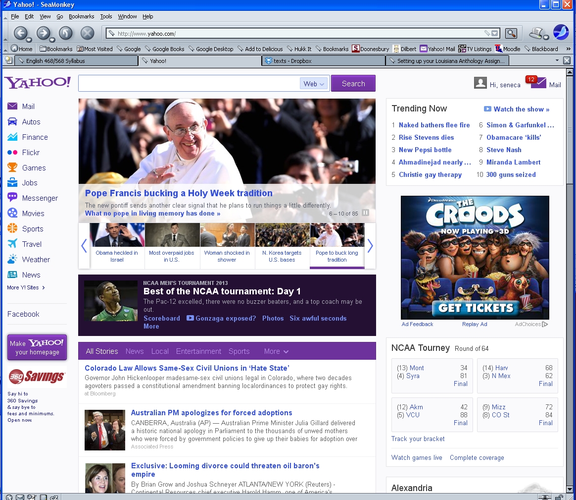
For my two sites, I compared the new Yahoo site with the Apple site. Both are portal sites to vast amounts of content. Yahoo just gave its site a makeover, one that has been widely criticized. Let's compare Apples to Yahoos and see what we think;
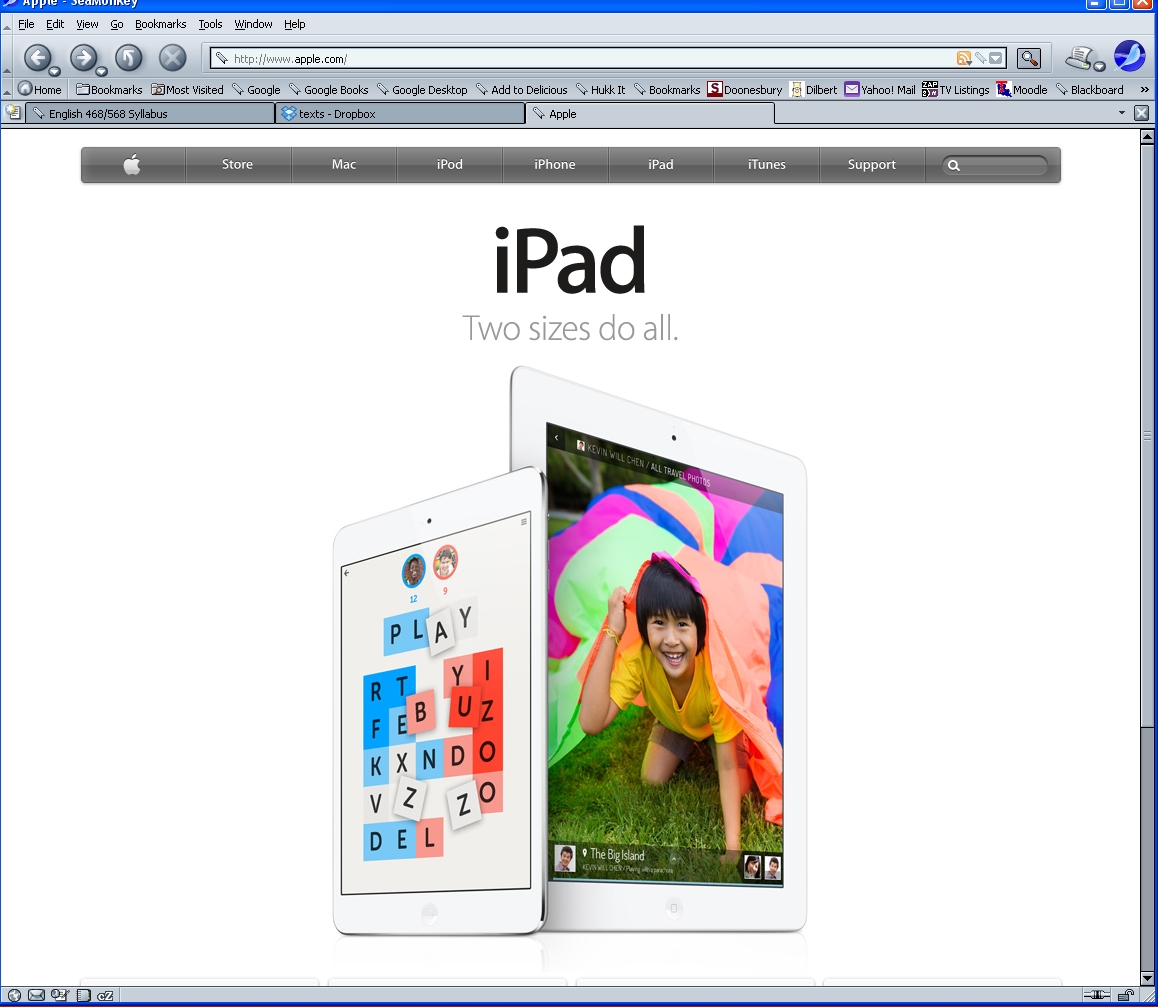
The Apple site is markedly simpler than Yahoo. The new
Yahoo site is cluttered. They kept the familiar fonts,
brands, and logos that define their brand. One hallmark
of modern web design is a grid system. Yahoo's site may
follow a grid system; if so, I haven't been able to figure it
out. It has a navigation bar on the left, crap on the
right, and the main column in the middle (not the
center - it's closer to the left side than the right).
The center column gave me vertigo; it scrolls down
forever. Or at least it seems like that. The top
image (with the newly elected Pope - Habemus papam!)
scrolls left and right. The page does everything but
spin. The front page to the portal should be clean and
lead deeper into the site. You can get lost on this page
By contrast, the Apple site is clean. It has a lot of
"white space," an important component of technical
writing. Empty space on paper costs money; on a web
site, it's practically free. Apple has a clean
navigation bar at the top of the page. The page is much
more symmetrical than the Yahoo site, which is off
balance. The Apple site has a bit of room to scroll down
to a few more Apple ads, but I quickly reached the
bottom of the page. The front images rotates
between iPhone and iPad when I reloaded, but only than.
No slide show (Which I consider to be the new .) No
spinning. No vertigo. Ahhhhhhhhh.
Also, the Apple site is consistent with the Apple style in
general. The MacIntosh was a friendly computer in a
user-surley world. The iPhone replaced clunky cell
phones with small screens and rows of tiny buttons with a
simple, elegant rounded rectangle. After Steve Jobs got
cancer, he convinced famous biographer Walter Isaacson to
write his biography. Isaacson brought the proof of the
book to Jobs for his approval; it looked like this;
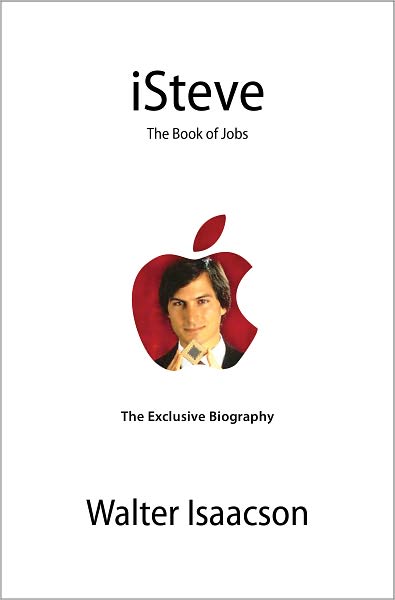
The book was critical of Jobs in several areas, but the only change that Jobs requested was that he redesign the cover. The original cover and title did fit the Apple design scheme, but they weren't very serious. iSteve? Please! This is what Jobs designed instead:
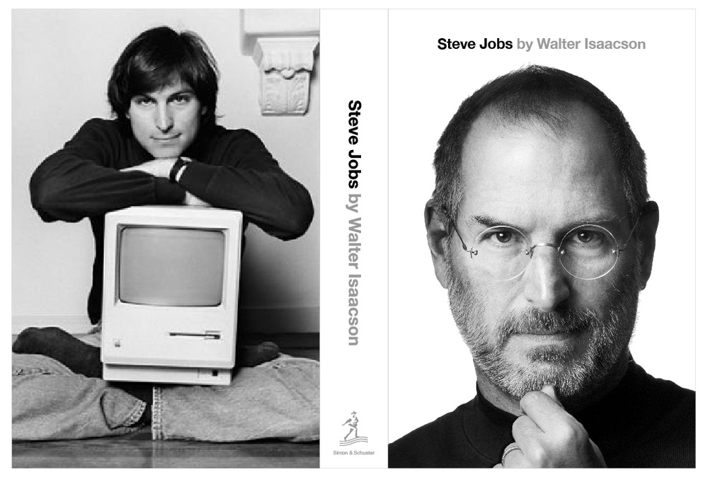
Here is a cover worthy of the Steve Jobs name in the Apple
style. Like Luke Skywalker, Jobs must confront his
greatest fear: not the fear of death, but the fear of becoming
what he hates the most. This is the man who brought down
Big Brother only to become Big
Brother.
This is a fitting cover for a man who remade the
world. The background is less the white of Heaven than
that of the Matrix, where Steve is waiting for Morpheus, Neo,
and racks full of guns.
But we haven't considered the way the sites adapt to smart
phones. Let's see how they look on my iPhone.

The iPhone test surprised me. Both sites have one site
for both mobile and desktop. Ironically, the new Yahoo
site is much more adaptive to mobile than the Apple
site. After the desktop view, the Yahoo mobile view is a
refreshing change. Instead of the cluttered, off-center,
three-column format, we get one column. The visitor can
still scroll down for the stories, but they don't clutter the
small screen the way the do the desktop. All the fonts
are clearly legible on mobile.
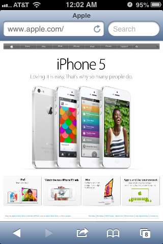
The Apple site is a disappointment. The moblie view is
the same as the desktop, making it much too small to be
useful. The regular font is tiny; the fine print
microscopic. The center display is legible, but the rest
is not. The bottom tiles are too small to read; the
navigation bar is unusable on the touch screen. The only
way to use the page is to expand it to 2 to 3 times its normal
size, requiring excessive scrolling to use it.
Modern web design is like three-dimensional chess.
There are numerous considerations that must be weighed against
each other. Without careful design, a web site may
only work well on a desktop computer, a mobile phone, or it
might not be appealing at all. The Yahoo site is much
more effective on mobile than on desktop; the opposite is true
for the Apple site. The perfect web page remains an
elusive goal even for the most talented professionals.
Home Page