Modeling of Data
It
is often useful to have a simple equation for a set of data that do not follow
a particular model. There are numerous
ways of modeling data. We will consider
three of these.
 Model 1: Linearization (Least Squares Fit or
Point-Slope)
Model 1: Linearization (Least Squares Fit or
Point-Slope)
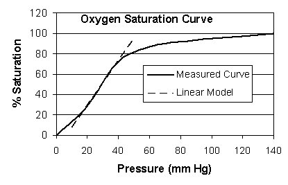
Consider
the data shown in the figure to the right.
This represents the relationship between hemoglobin saturation [Hb] and oxygen pressure (![]() ). Clearly this curve
is nonlinear. However, in some cases we
might be interested in the behavior of a system around a particular point on
the curve. For example, if blood at the
capillary level is maintained in a range of 20 to 40 mm Hg, we can model this
part of the curve as a straight line with only a small amount of error. It would be ridiculous to think that a
straight line could model the complete curve, but in the range of interest, the
linear model (dashed line) matches the measured curve astoundingly well.
). Clearly this curve
is nonlinear. However, in some cases we
might be interested in the behavior of a system around a particular point on
the curve. For example, if blood at the
capillary level is maintained in a range of 20 to 40 mm Hg, we can model this
part of the curve as a straight line with only a small amount of error. It would be ridiculous to think that a
straight line could model the complete curve, but in the range of interest, the
linear model (dashed line) matches the measured curve astoundingly well.
To
obtain the least squares fit, it is first necessary to define an error criterion. Qualitatively we say that the difference
between the measured data and the model is as small as possible. Mathematically, we say:
Eq. 1
![]() ,
,
where ![]() is the measured value
of y (corresponding to the “Measured Curve” in the figure above),
is the measured value
of y (corresponding to the “Measured Curve” in the figure above), ![]() is the value that the
model provides (corresponding to the dashed line in the figure), and N is the number of data points available. For a linear model,
is the value that the
model provides (corresponding to the dashed line in the figure), and N is the number of data points available. For a linear model, ![]() , so that:
, so that:
Eq. 2
![]()
This
is a mathematical description of what we mean by the best fit. The square of the difference is useful
because this quantity is always positive.
If there were both positive and negative terms, it would be possible for
large positive errors to cancel out large negative errors in the model. An alternative to the square would be simply
to take the absolute value. The
resulting equation would be different from the least squares equation, but, if
we chose to define “best fit” this way, it would still be a valid model.
To
determine the values of a and b that satisfy the error criterion, it is
necessary to minimize by taking the derivative with respect to each variable
and setting the result equal to zero. In
other words:
Eq. 3
![]()
Eq. 4
![]()
We
can move the derivatives into the sum (because the derivative and sum are both
linear operators) and then take the derivative to obtain:
Eq. 5
![]()
![]()
![]()
![]()
Eq. 6
![]()
![]()
![]()
The
last sum in Eq. 5 is ![]() , and
, and ![]() is just N times the average of all of the x’s, which we will designate as
is just N times the average of all of the x’s, which we will designate as ![]() . The last term in Eq. 6 is just
. The last term in Eq. 6 is just
Eq. 7
![]()
Eq. 8
![]()
Since
all of the experimental data are known, the only unknowns are m and b, so these two equations can be solved simultaneously for m and b. Eliminating ![]() by multiplying Eq. 8 by
by multiplying Eq. 8 by ![]() and subtracting gives:
and subtracting gives:
Eq. 9
![]() ,
,
which
can be solved for m to yield:
Eq. 10

and
from Eq. 8,
Eq. 11

Taylor Series Model
The
linear regression model is similar to taking a
Eq. 12
![]()
A
simple linear model can be obtained by using only the first 2 terms of this
expansion. In other words, this method
simply uses the tangent line to the curve at the point of interest as a model. Again, this would cause huge errors, in
general, for points that are far away from ![]() , but if our interest is only on places near enough to
, but if our interest is only on places near enough to ![]() , the error will be small.
, the error will be small.
Of
course, more accurate models can be obtained by taking more of the terms of the
Power Law Model
In
some cases it is useful to use a model of the form:
Eq. 13
![]() ,
,
where
the three parameters a, b, and a are obtained by curve fitting. There is an interesting trick that can be
used to find a, b and a, which starts with the logarithm of the model:
Eq. 14
![]()
If
a value of a is already selected,
then this transformed equation is linear in ![]() and
and ![]() . That is, a least
squares fit of
. That is, a least
squares fit of ![]() as a function of
as a function of ![]() will give
will give ![]() as the slope and
as the slope and ![]() as the y-intercept. The hemoglobin saturation curve does not fit
well to this type of model. However,
some phenomena fit this model well, such as the relationship between velocity
in a fluid and current from a hot film anemometer.
as the y-intercept. The hemoglobin saturation curve does not fit
well to this type of model. However,
some phenomena fit this model well, such as the relationship between velocity
in a fluid and current from a hot film anemometer.
Fourier Series
Model
The
Fourier series model can be truncated to only a few terms. For example, consider the hemoglobin
saturation curve again, and take as a model:
Eq. 15
![]()
This
is a two-term Fourier series model.
There are different ways to find the values of A, B, a and j. One way is to take the fast Fourier transform
of the data sequence directly. For
example, the fft function in Matlab
can be used. Assuming you have the data
in the variable Hb, you can do the following:
N=length(Hb);
PO2max
= 65;
a=2*pi/PO2max;
X=fft(Hb)./N;
A=X(1);
B=abs(X(2));
Phi=angle(X(2));
An
alternative method is to pick three features of the curve and fit these to the
model directly. For example, if you
think of the curve as being shaped like a sinusoid, the middle of the sinusoid
appears to be at about where percent saturation is 40. We will take this as the offset of the sine
wave (i.e. A=40). The
peak of the sine wave appears to be at the point (70,90),
which means that the amplitude, B,
should be 90-40, or 50. Assume you want
the model to fulfill, in addition, the following two criteria:
a
b Eq. 16
[Hb] = 0 at
![]() = 0
= 0
![]()
Now
you have two equations and two unknowns that can be solved simultaneously.
a
Eq. 17 b
![]()
![]()
From
Eq. 17a, ![]() , and with this in 17b we get
, and with this in 17b we get
Eq. 8
![]() .
.
This
leads to the model:
Eq. 18
![]()
Exercises:
Assume
that your data follow the function ![]() .
.
- Use Excel to generate
a set of 10 discrete values of this data set from
 to
to  . With these
values, construct a linear regression model of the data around the point
. With these
values, construct a linear regression model of the data around the point  . Plot the data
and the regression model on the same plot.
Note that the linear regression output includes a parameter
“R.” This is an indicator of the
“goodness of fit.” A value of R
close to 1 indicates an excellent fit to the data. What is the value of R for your fit?
. Plot the data
and the regression model on the same plot.
Note that the linear regression output includes a parameter
“R.” This is an indicator of the
“goodness of fit.” A value of R
close to 1 indicates an excellent fit to the data. What is the value of R for your fit? - Calculate the to ).